lululemon · 02/15
Giving runners a visual language that moves at their pace.
Extending the Manifesto into a new arena: running.
- Client
- lululemon
- Year
- TK
- Role
- Creative direction · Design system
- Scope
- Illustration · Typography · Motion · Campaign toolkit
Not decoration. Not differentiation for its own sake. A system built to run.
The project
Extend the Manifesto into the run category. Amplify the living system for movement-led moments, environments and stories — while staying unmistakably lululemon.
The challenge. lululemon’s most iconic brand expression had just evolved into a living system — but running asks for something else. More energy, more motion, more intensity. The risk was turning the volume up and losing the humanity at the core.
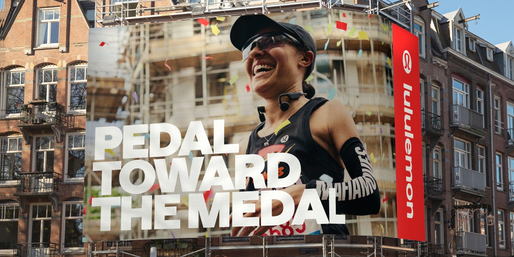
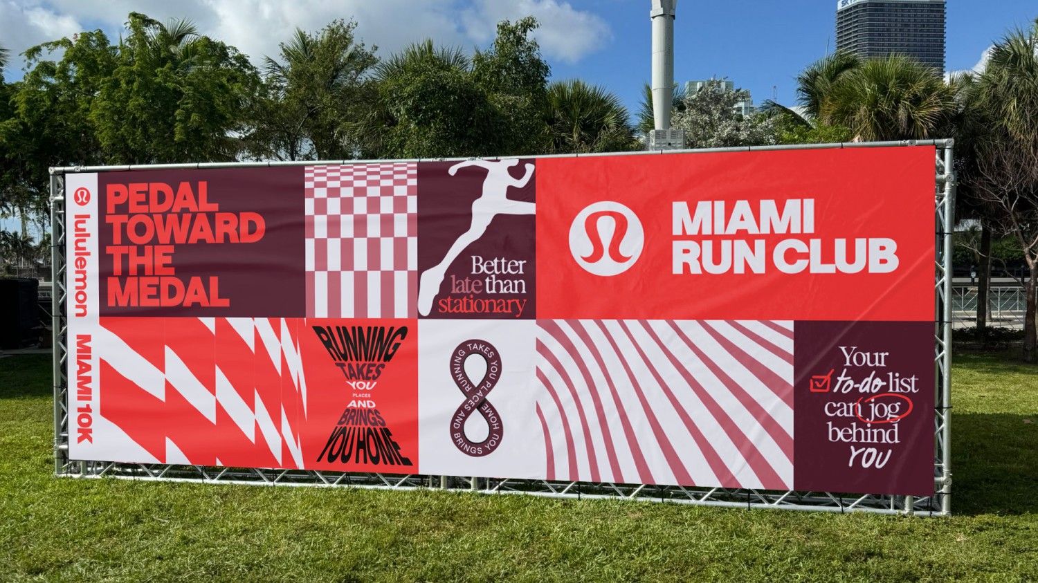
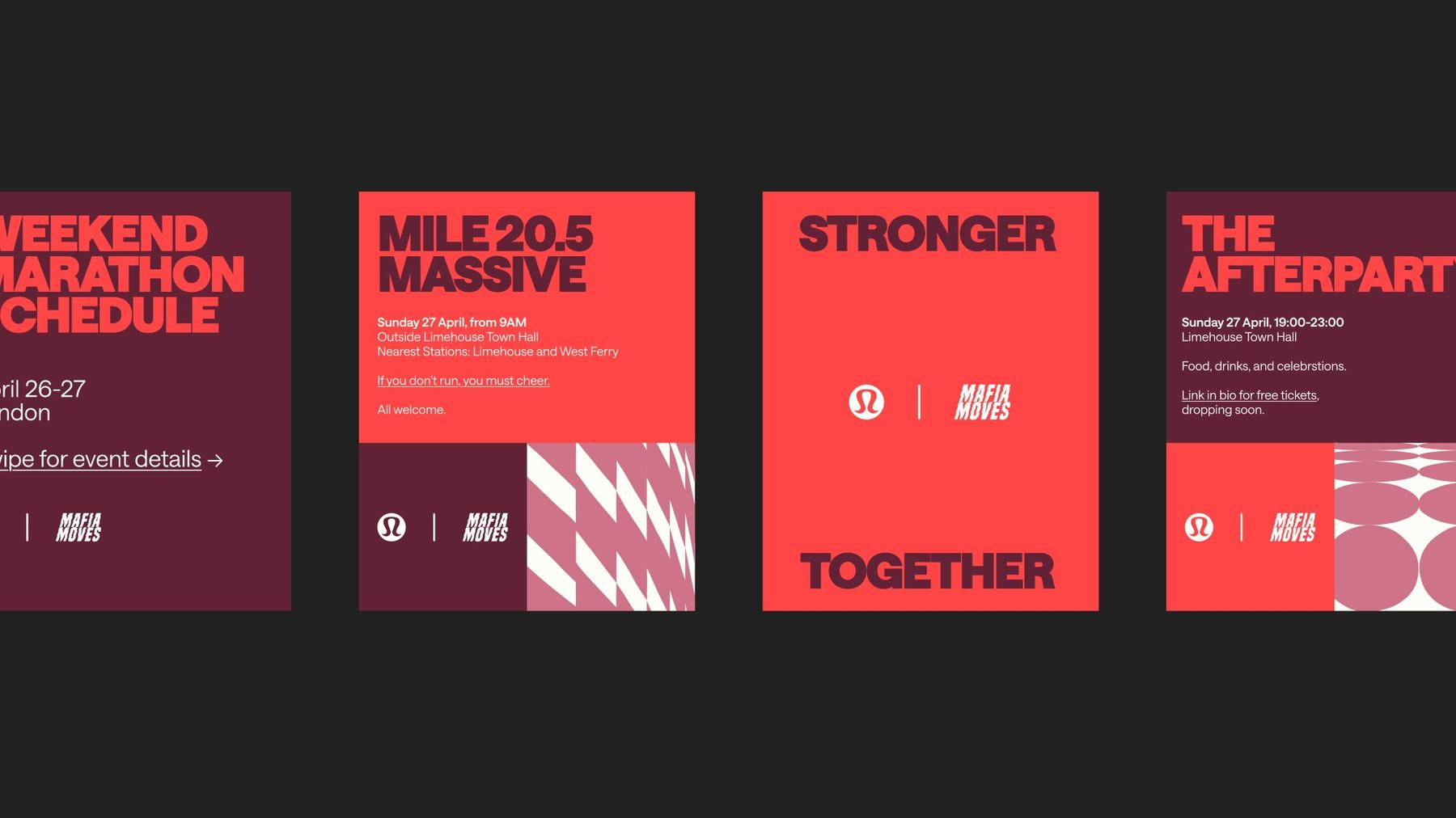
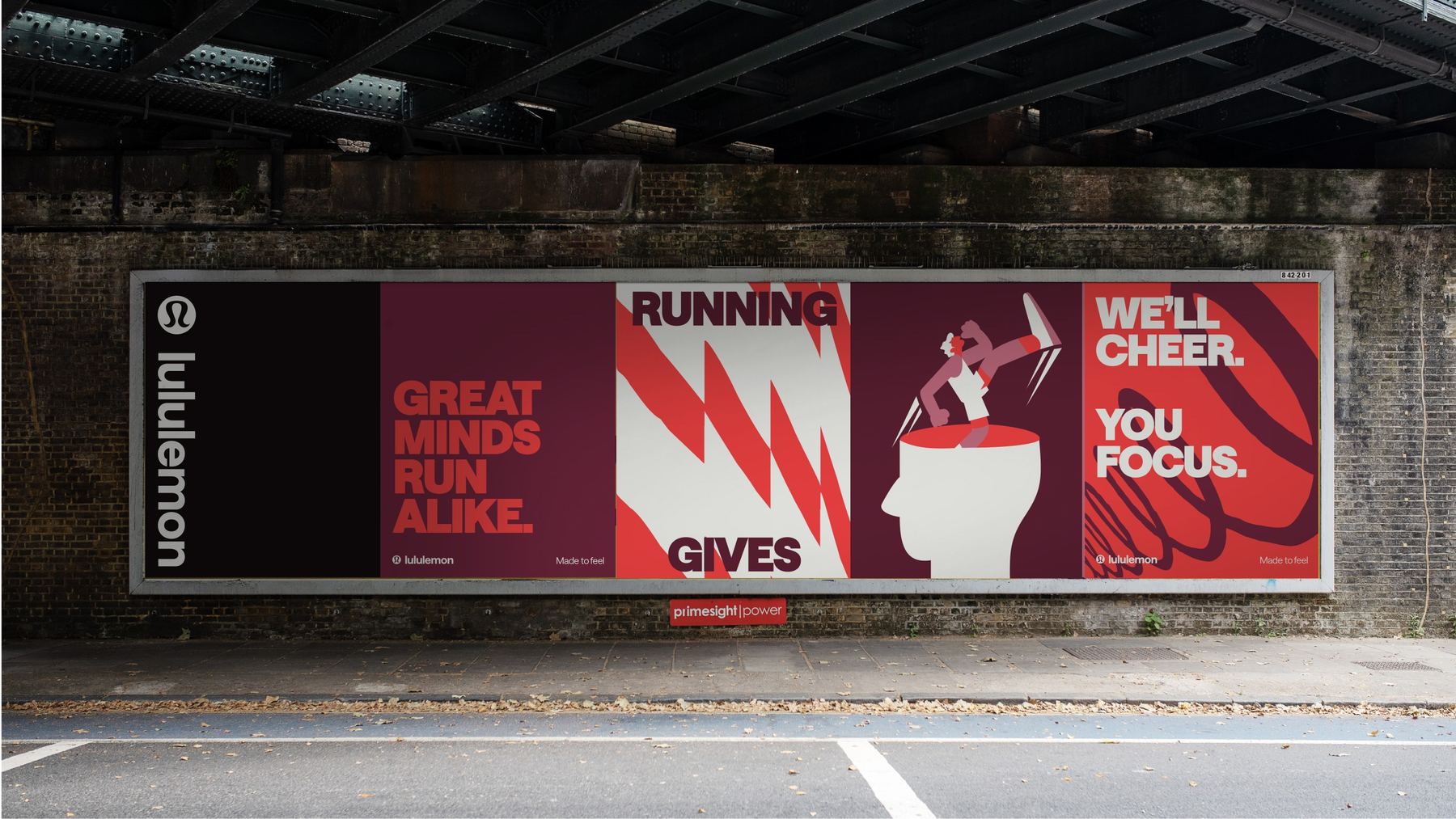
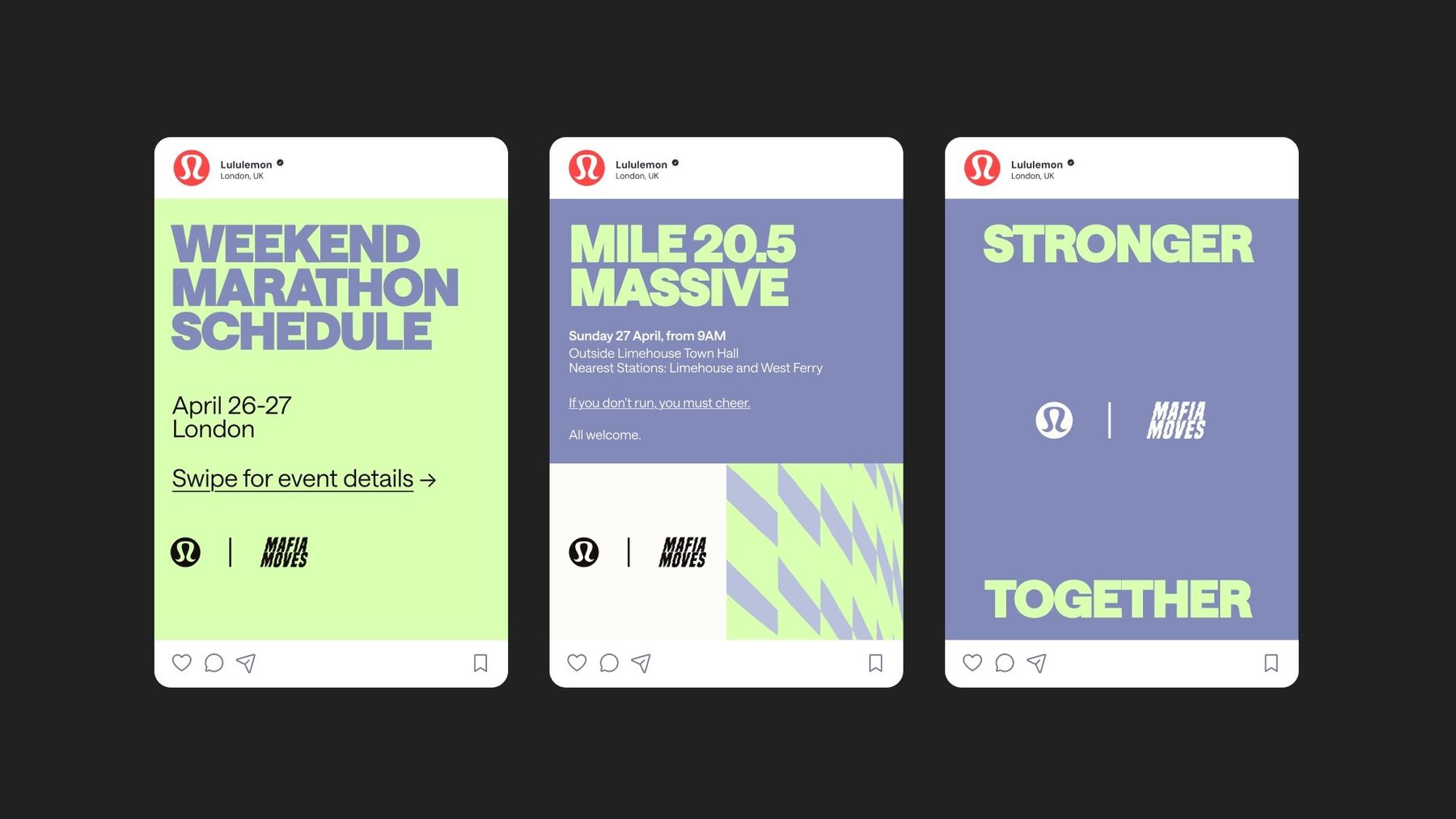
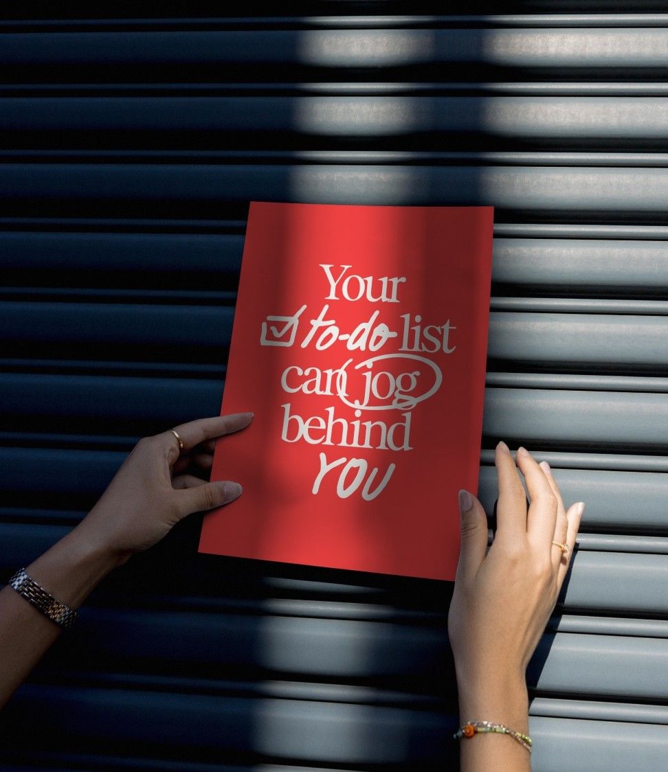
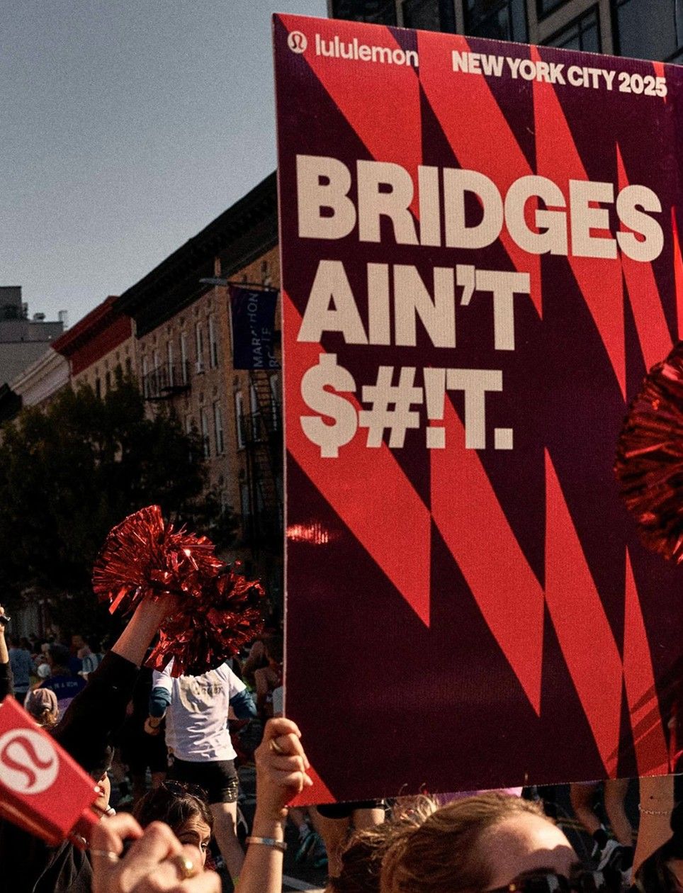
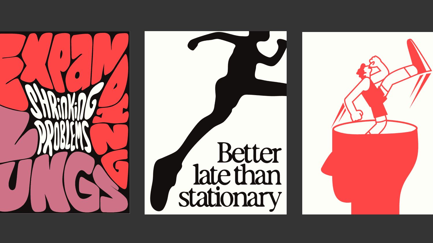
Our approach. We worked modularly, expanding the system with bold new illustrations and expressive typography designed specifically for run. We pushed scale, weight and rhythm — amplifying lululemon’s core type system with something bigger, louder and more kinetic.
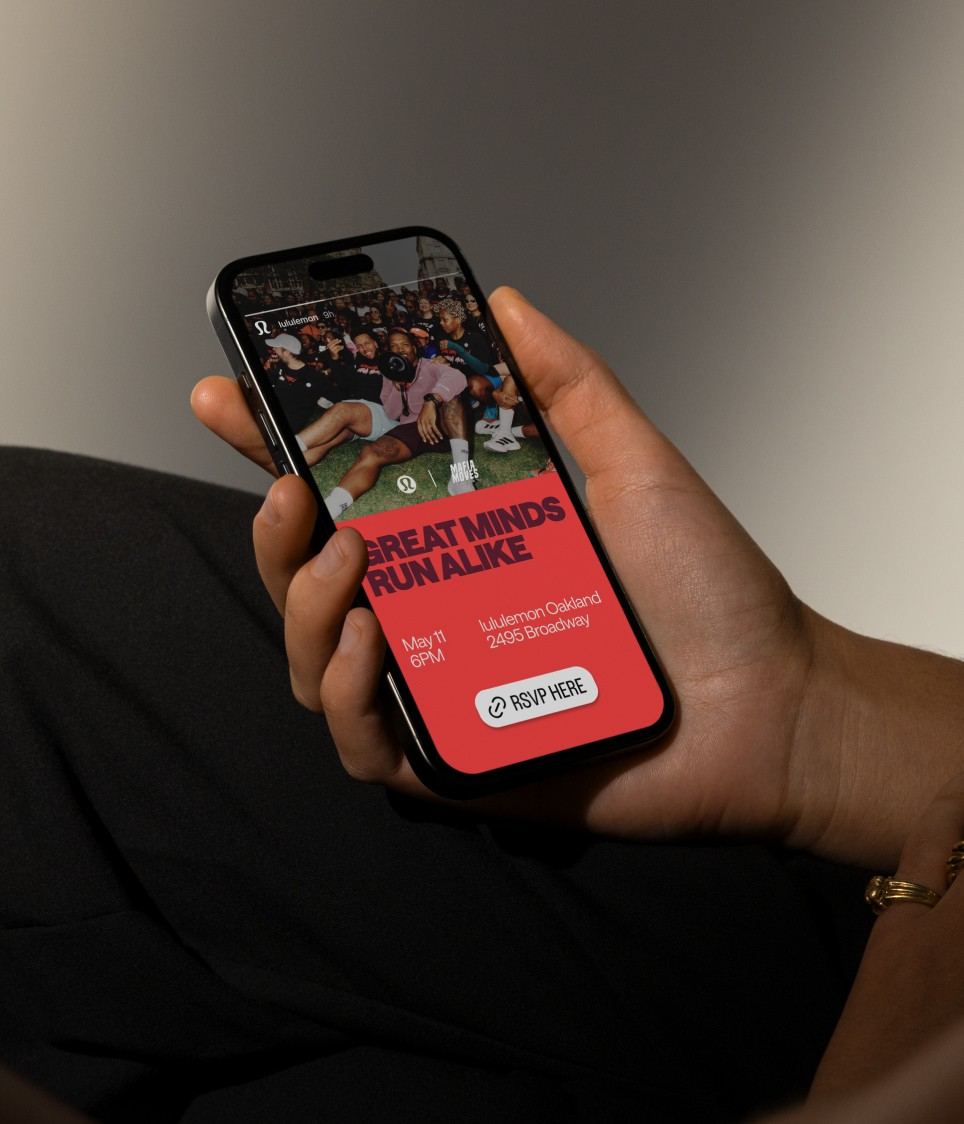
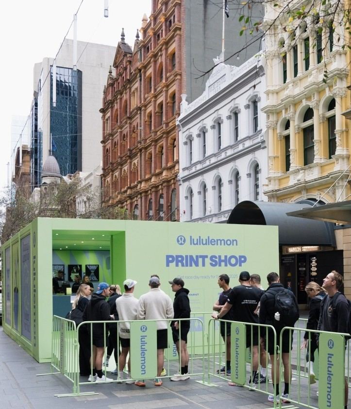
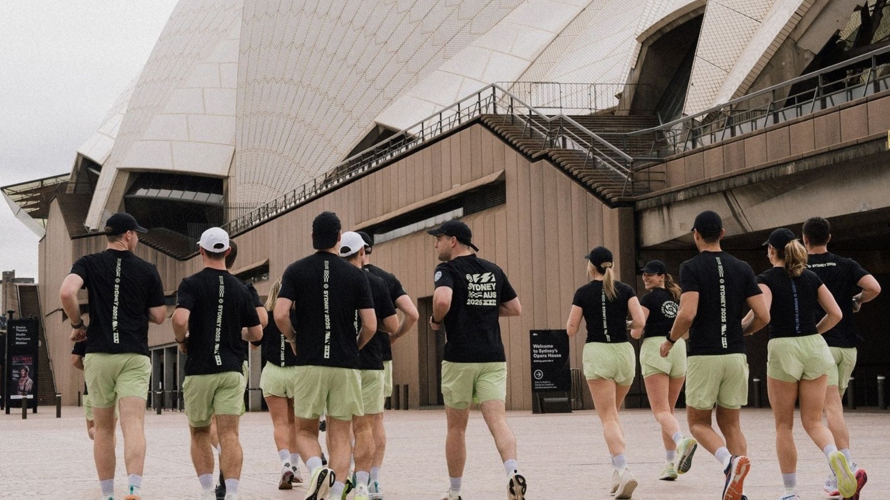
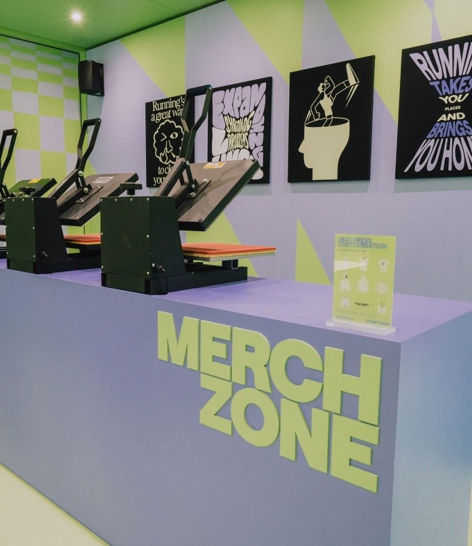
04 · The result
It doesn’t just support the run — it runs with it.
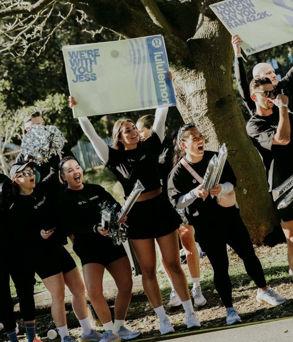
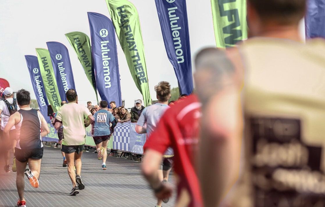
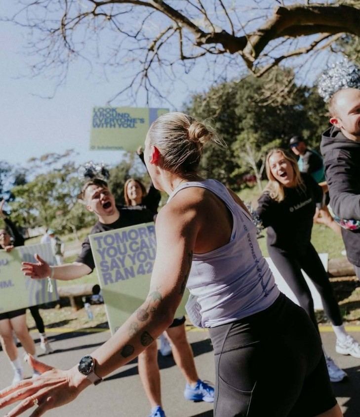
RUN ID brings the Manifesto into motion: confident, visceral and unapologetically expressive. A system that reflects the intensity of running while staying unmistakably lululemon.
Credits
Tsz Ho Ip · Michelle Han · James Dunphy