Nike · 13/15
Not a static message. A living expression of intent.
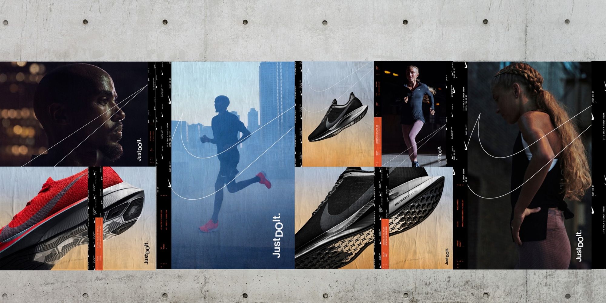
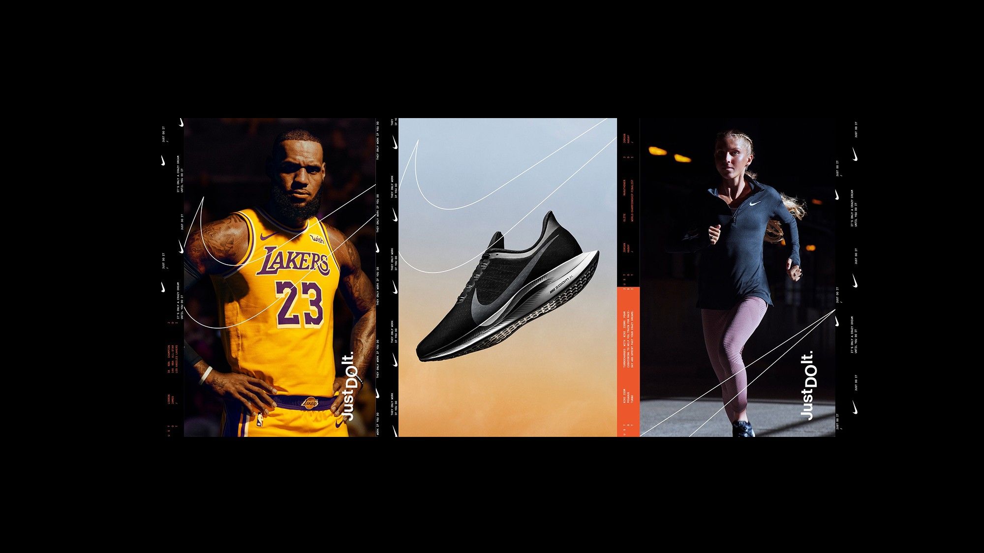
A bold, modular design system for Just Do It — dynamic, expressive and built to move.
- Client
- Nike
- Year
- TK
- Role
- Design system · Art direction
- Scope
- Kinetic typography · Motion · Stills · Retail · .com · Digital · Social
Rather than a single campaign moment, a visual language built for constant motion.
The project
Build a flexible visual language capable of scaling across formats and platforms — adapting to different messages, products and environments while keeping a clear, unmistakable point of view.
The challenge. Just Do It has to show up everywhere, all the time. A single campaign moment can’t stretch that far without losing impact.
Our approach. Kinetic typography, rhythmic composition and confident use of scale bring the system to life in both motion and stills. The language is designed to flex.
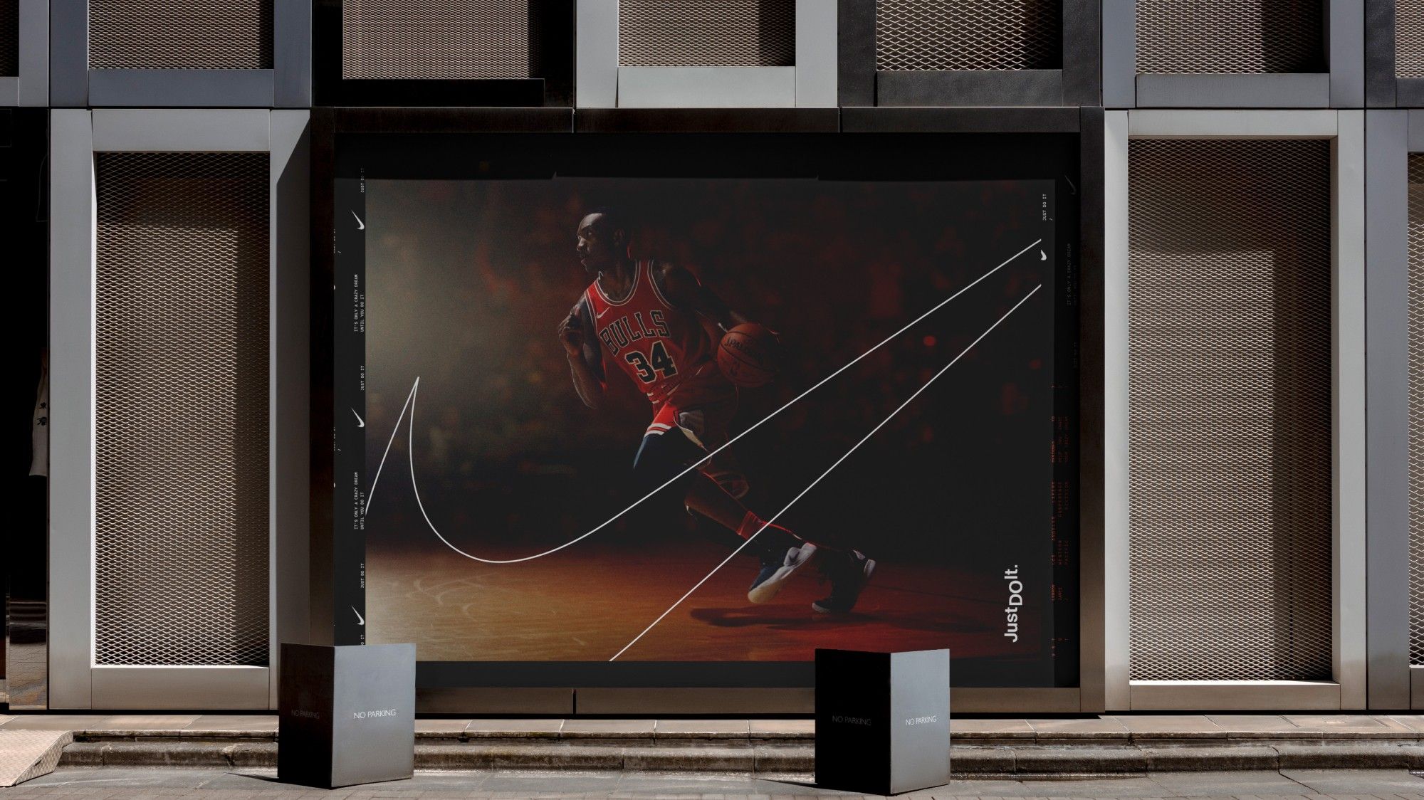
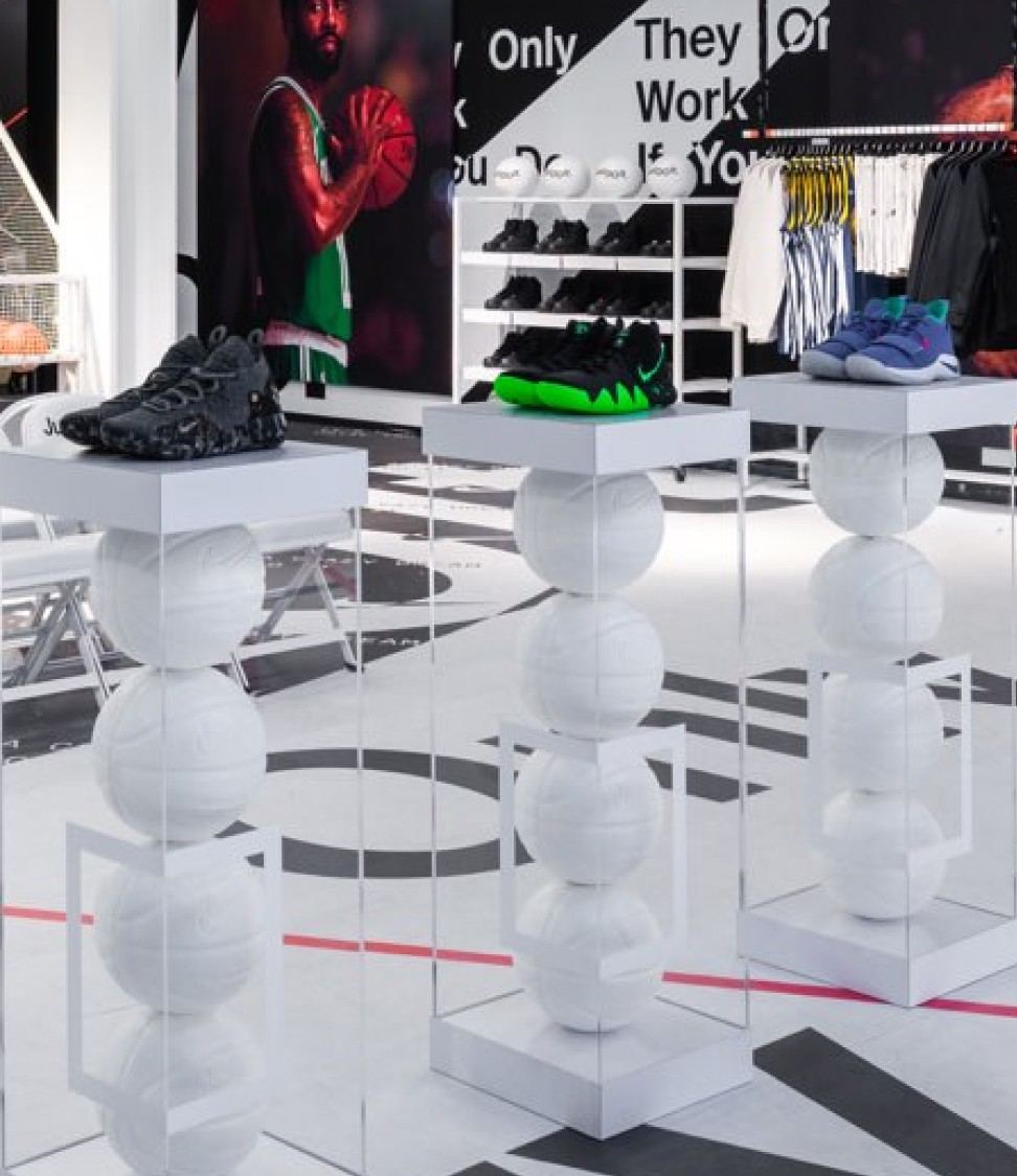
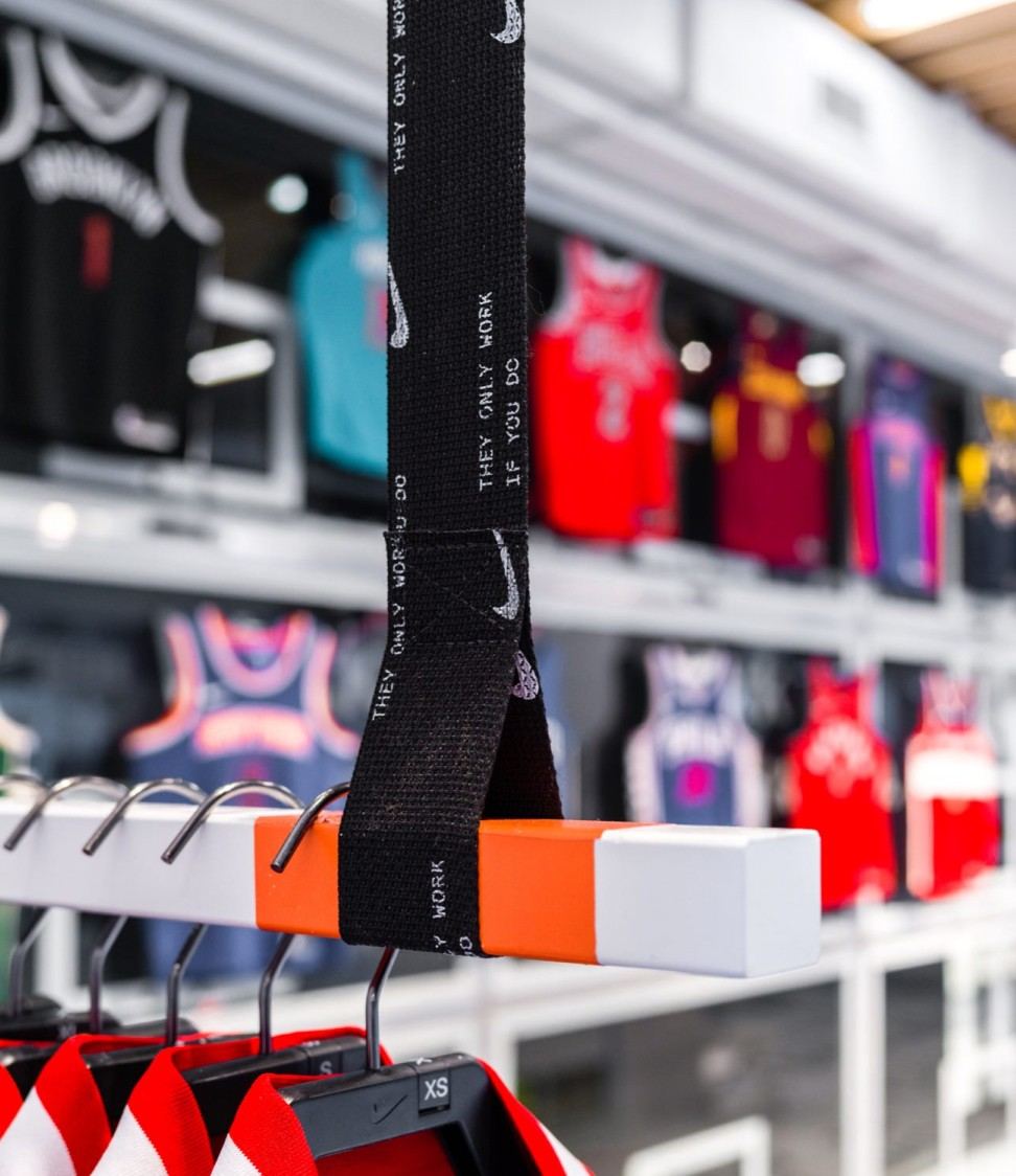
04 · The result
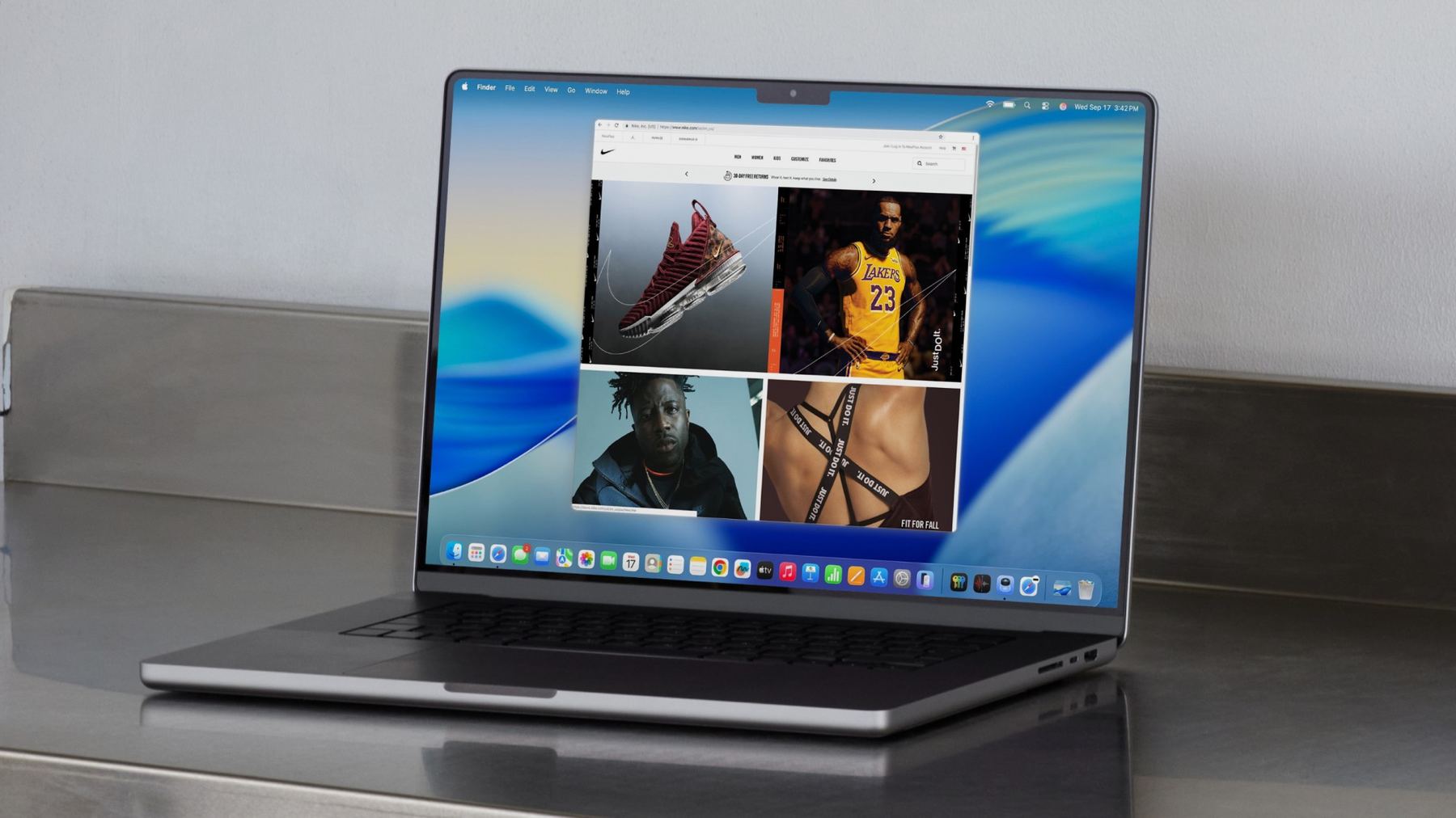
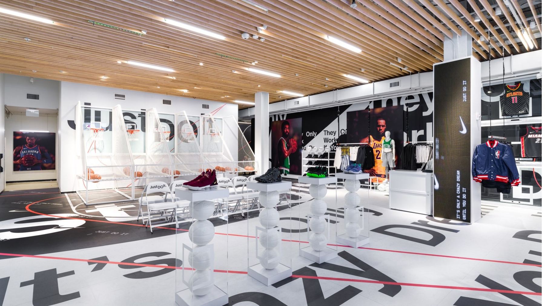
A system that feels alive wherever it shows up.
Executed across retail, .com, digital and social — direct, energetic and highly adaptable, reinforcing Just Do It as a platform built for constant motion.