Samsung · 08/15
Giving a voice assistant a vibe.
The UX visual look and feel for Bixby 2.0 — the assistant that lives across mobile and home devices.
- Client
- Samsung
- Year
- TK
- Role
- UX visual design · Design language
- Scope
- Interaction states · Motion · Mobile and home devices
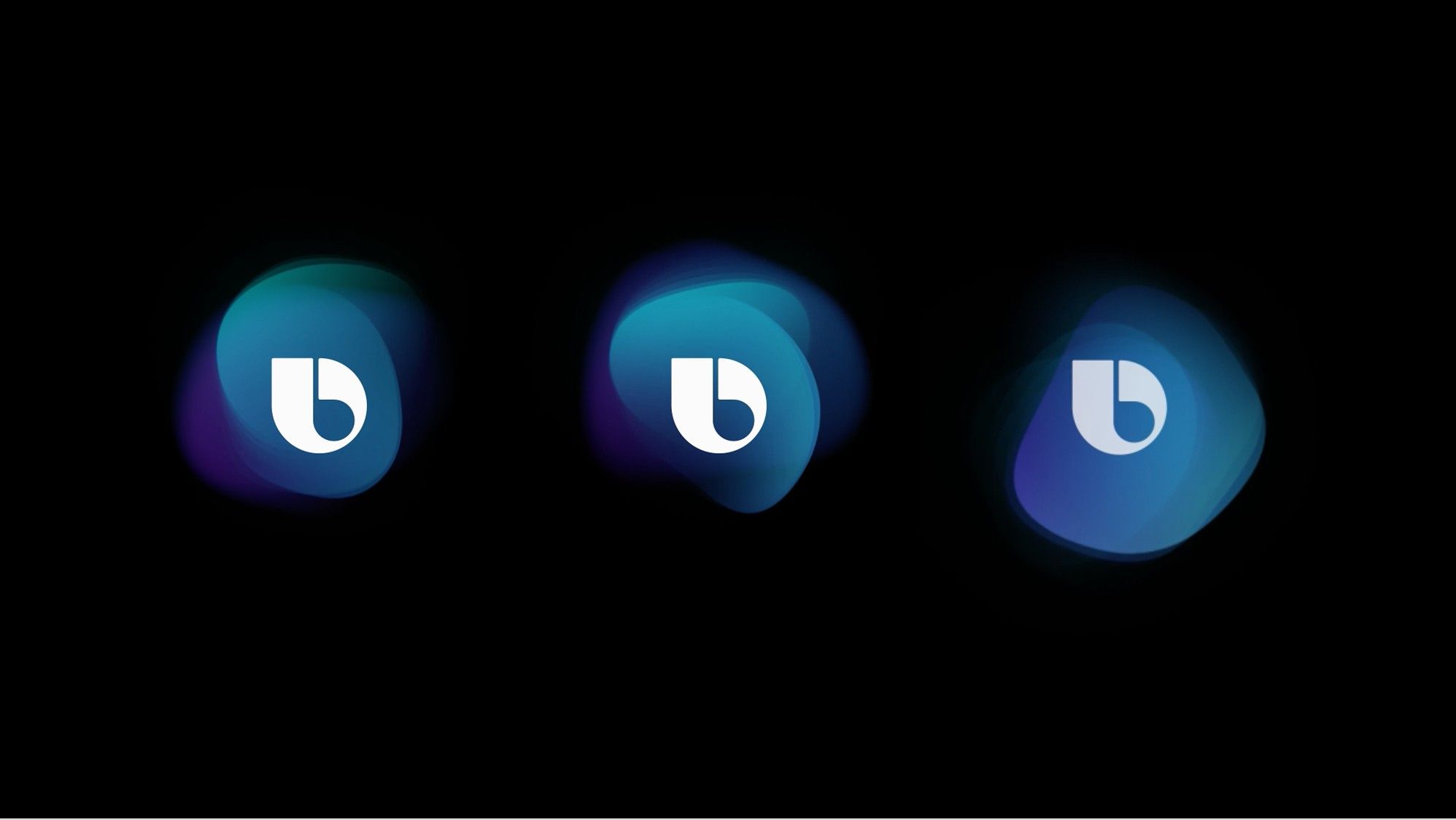
Bringing order to ambiguity: a defined edge, drawn out of blurred ones.
The project
Shape the UX visual look and feel for Bixby 2.0, balancing humanity and tactility with the marvel of the technology — consistently, across phones and Samsung’s wider ecosystem of smart devices.
The challenge. Bixby is always learning — from you, from the cloud, from its environment. An intelligence that is never finished is hard to give a face, and harder to make comforting.
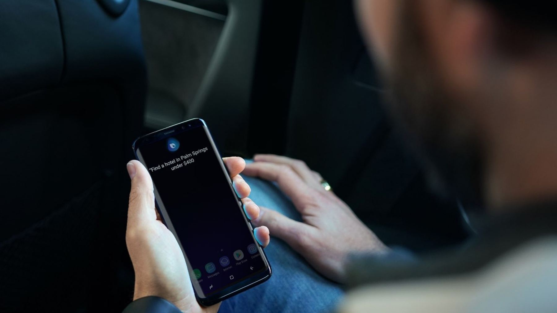
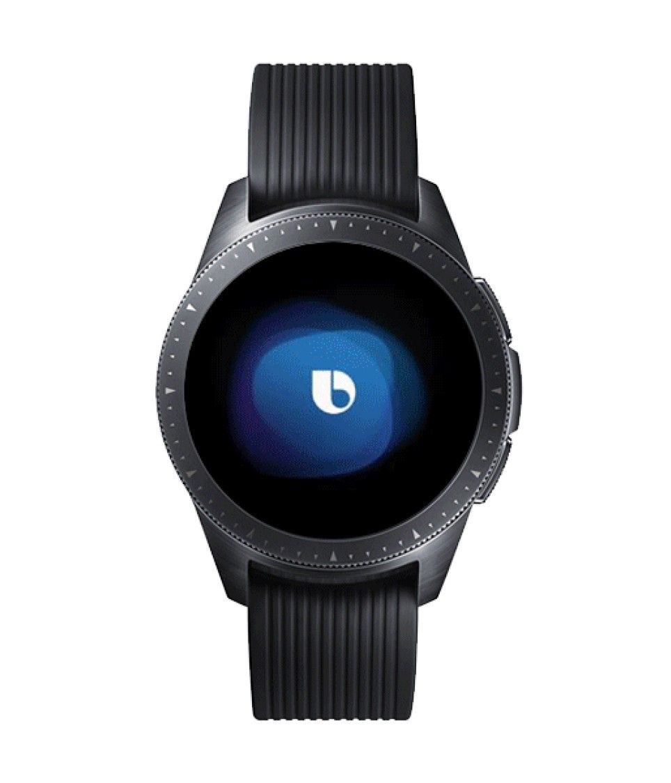
Our approach. We treated Bixby as a presence that floats just above everyday life — elegantly appearing when needed and disappearing when not. The system was structured around four key interaction states: Listening, Streaming, Processing and Results, creating a consistent, comforting rhythm for voice-led experiences.



04 · The result
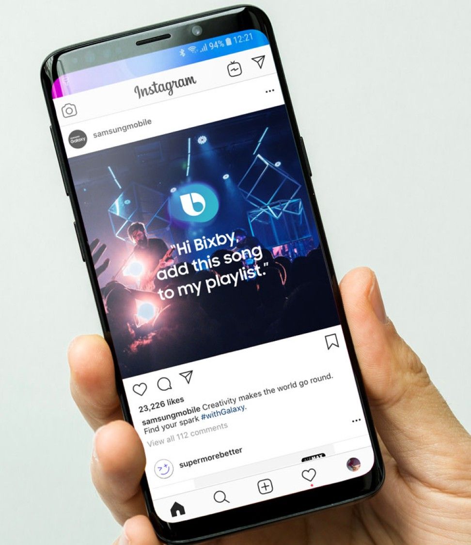
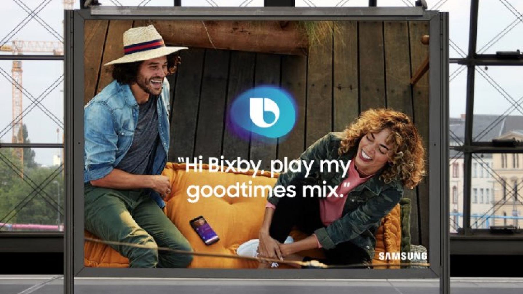
Bixby’s character, defined at scale.
Rolled out across millions of daily interactions — installed on 10+ million devices at the time — and supported through continuous iteration alongside Samsung’s internal design team.